Flow Cytometry Data
Flow cytometry is a powerful tool to analyse cells based on their size, granularity and expression of various intracellular and membrane bound proteins. Thereby, the datasets it produces are multidimensional, with thousands of cells and protein expression levels for each of these. As flow cytometry relies on lasers to analyse expression patterns, overlap between the laser emission spectra can lead to a false amplification of the fluoresensce signal. This requires the data to be transformed based on a spillover matrix calculated from compensation controls aquired with the samples. These preprocessing steps can be done in R, but are much easier in FlowJo, so that is what we’ll do here. Click to learn more about flow cytometry.
Data Preprocessing in FlowJo
As we want to focus more on the R side of things, I won’t spend too much time explaining how to use FlowJo. Briefly, we want to compensate the data to save us from having to do it in R, and we then want to gate our population of interest to mitigate some of the background noise. For example, if you want to look at T cells, you would gate: Lymphocytes → Single Cells → Live Cells → CD3+ Cells. #####Here are some links you may find useful:
Assuming you have compensated and pregated your data, we can now move on to exporting it. Select all your populations of interest (ex. all CD3+ gates), right click and select “Export/Concatenate Populations”, under parameters select “All compensated parameters”, rename your files and click export. Now we can move on to R.
Data Analysis in R
Setting up your environment
There are a few libraries you’ll need to install before starting, see the full list below.
library(ggrepel)
library(flowCore)
library(tidyverse)
library(rsvd)
library(cytofkit2)
library(ComplexHeatmap)
library(Rtsne)
Some of the algorithms we’ll be using have a random component to them. We want to keep this constant to ensure reproducibility. We can do this with the following command. The set.seed() function sets the starting number used to generate a sequence of random numbers.
set.seed(1234)
Now we can point R to the directory from which we will be working. Modify this depending on the where you exported your .fcs files to.
setwd('~/Desktop/')
Data Import
Here we list all the files in the Desktop/Data/ direcotry and read the fcs files.
fcs_files <- list.files('./Data/')

fs <- read.flowSet(files = fcs_files,
                   path = './Data/')
Data Preprocessing
First, let’s change the column names of our data, if you named them when you aquired the data you can just run the following code. This gets all your prespecified names and replaces the laser names with these (for example “B530/30” would become “CD3”).
p <- flowCore::parameters(fs[[1]])$desc

colnames(fs) <- sapply(1:length(p), function(i){
  if(is.na(p[i]) | p[i] == "NA") {
    return(colnames(fs)[i])
  } else {
      p[i]
    }
})
If you didn’t do this when aquiring your data, you can manually specify the column names.
colnames(fs)
 [1] "FSC-A"             "SSC-A"              "FJComp-B 530_30-A"

colnames(fs) <- c('FSC-A', 'SSC-A', 'CD3')
Data Transformation
To help with visualisation and analysis of the data, we need to transform it. What I’ve found to work best is the estimateLogicle() transformation function, but there are many others. First we specify the columns we’d like to transform (all except FSC and SSC channels), followed by calculating and applying the transformation function.
vars <- colnames(fs)[-grep('FSC|SSC', colnames(fs))]
transform_func <- function(x) transform(x, estimateLogicle(x, vars, m = 5.5))
fs <- fsApply(fs, transform_func)
And finally we want to convert our data from a ‘flowSet’ to a data frame. Here we add a column called “sample_names”, to distinguish between different samples.
df <- data.frame(fsApply(fs, flowCore::exprs),
                 'sample_names' = rep(sampleNames(fs), fsApply(fs, nrow)))
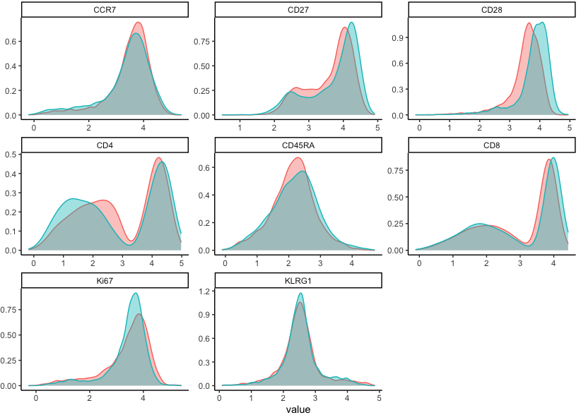
Let’s take a look at our transformed data.
df %>%
  select(cols, sample_names) %>%
  gather(key, value, -sample_names) %>%
  ggplot(aes(x = value, colour = sample_names, fill = sample_names)) +
  geom_density(alpha = 0.4) +
  facet_wrap(~key, scales = 'free') +
  theme_classic()
Optional: If your dataset is very large, for the purposes of this example I suggest downsampling to save some time. Here we downsample the data to 5k cells per unique sample.
nrow(df)
[1] 188118
df <- groupdata2::balance(df, 5000, 'sample_names')
nrow(df)
[1] 10000
Clustering
We are now ready to start analysing our data. First we will use the Phenograph algorithm to cluster the data into different cell populations. We need to specify which markers we want to use for clustering. If you are using a large dataset I recommend using the following multicore version of Phenograph instead - FastPG.
cols <- c('CD4', 'CD8', 'Ki67', 'CD27', 'CD45RA', 'CD28', 'KLRG1', 'CCR7')

df['clusters'] <- df %>%
  select(cols) %>%
  Rphenograph(., k = 30) %>%
  .$membership

table(df$clusters)

   1    2    3    4    5    6    7    8    9   10   11   12   13
  44  711 1048 1048  416  204  935  834 1291 1283  588  823  775
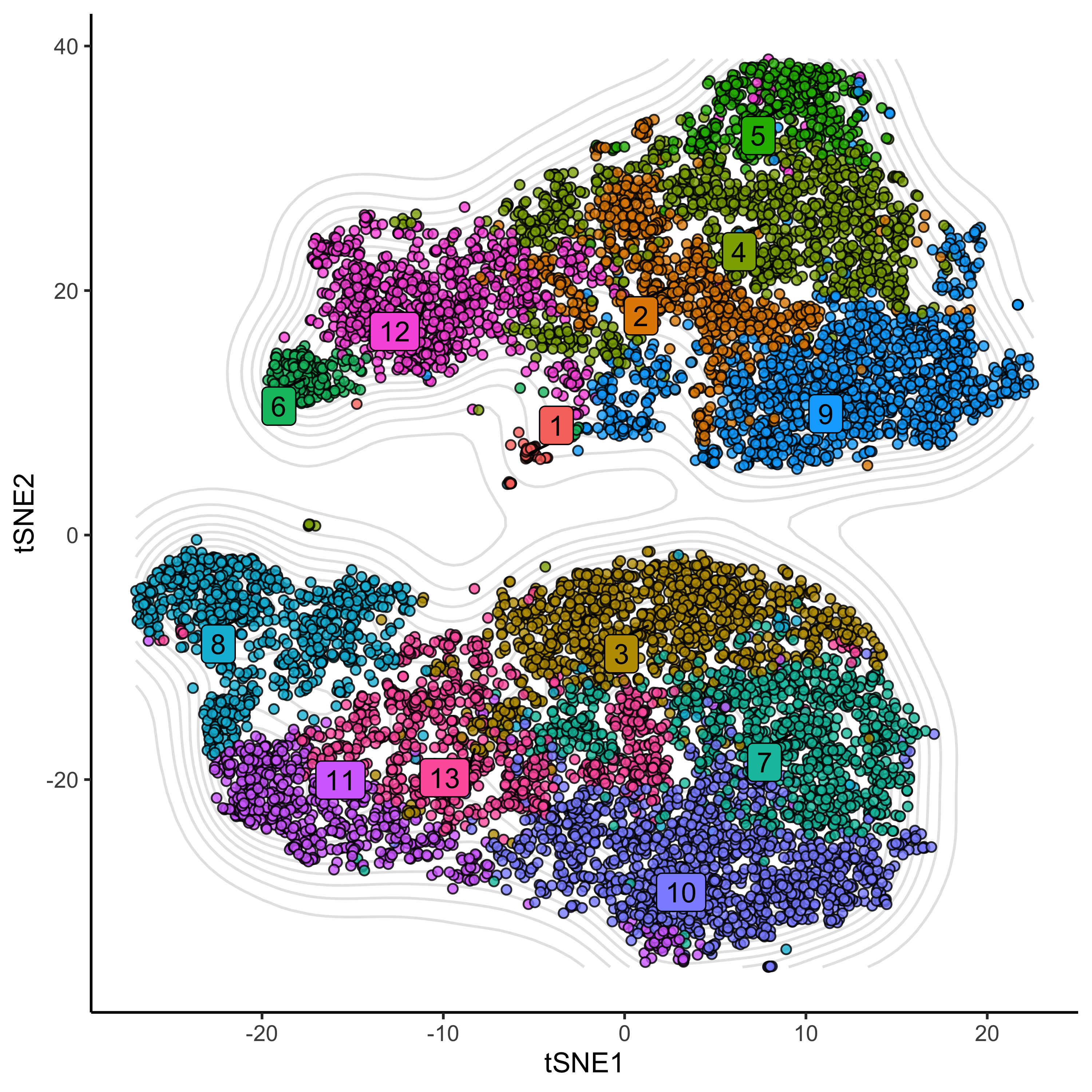
Now that we have calculated our cell clusters, let’s visualise their marker expression.
df %>%
  select(cols, clusters) %>%
  group_by(clusters) %>%
  summarise_all(median) %>%
  remove_rownames() %>%
  column_to_rownames('clusters') %>%
  as.matrix() %>%
  pheatmap:::scale_rows() %>%
  Heatmap(rect_gp = gpar(col = "white", lwd = 2),
          column_names_rot = 45, show_heatmap_legend = T,
          row_names_side = 'left', heatmap_legend_param = list(title = 'Z-score'),
          col = circlize::colorRamp2(seq(min(.), max(.), length = 3), c('#4575B4', 'white', '#D73027')))
Dimensionality Reduction
Next, we can implement dimensionality reduction algorithms such as tSNE (t-distributed Stochastic Neighbourhood Embedding) or UMAP (Uniform Manifold Approximation and Projection), to help us visualise the data. Again I recommend using a multicore implementation of these if you are using a large dataset - Flt-SNE. Perplexity and other hyper-parameters have a big impact on the final embedding, I recommend using values specified as in this paper.
df[c('tSNE1', 'tSNE2')] <- df %>%
  select(cols) %>%
  Rtsne(perplexity = nrow(.)/100,
        theta = 0.5,
        num_threads = 0) %>%
  .$Y
And plotting.
ggplot(df, aes(tSNE1, tSNE2)) +
  geom_density2d(colour = 'grey90') +
  geom_point(aes(fill = as.factor(clusters)), alpha = 0.8, colour="black", pch = 21) +
  geom_label_repel(data = t_clus_ds, aes(label = clusters, fill = as.factor(clusters)), colour = 'black') +
  theme_classic() +
  theme(legend.position = 'none')