Shapley Values for Cytometry Data Interpretation
Introduction
Dimensionality reduction techniques help us condense high-dimensional data, however these can sometimes be difficult to interpret, especially when you try to consider how much each feature actually contributes to the result. In the field of explainable AI, Shapley values are frequently used to interpret the feature importance of a particular ‘black box algorithm’. I recently came across this neat python library by Wilson E.Marcílio-Jr, which allows you to calculate Shapley values of clusters in a dimensionality reduction plot. To get more information on the library and its implementation, you can read the author’s paper. To illustrate the usefulness of this library, below I have tried to implement it in the analysis of cytometry by time of flight (CyTOF) data.
Background on Shapley Values
Shapley values were first introduced in 1951 by nobel laureate Lloyd Shapley, in the field of cooperative game theory. The problem was to divide the payoff of a particular coalition in a ‘fair’ manner. If for example you are working on a group project at university, each group member’s grade should be proportional to the amount of work they put into it. So the Shapley value is the “average marginal contribution of a feature value across all possible coalitions”. To learn more about Shapley values, take a look at this resource.
Using Shapley Values to Explain CyTOF Data Celltypes
Let’s first load the required libraries. Because I am using a python library for tSNE, I have to import some extra functions.
library(HDCytoData)
library(rsvd)
library(reticulate)
library(tidyverse)
library(ggpubr)

source('~/development/FIt-SNE-master/fast_tsne.R', chdir=T)
reticulate::use_python('/usr/local/bin/python3.9', required = T)
Now we can import our data. We can use one of the publicly available CyTOF datasets in the HDCytoData package. This dataset contains the expression of 13 surface marker proteins as well as manually gated cell population labels for 24 cell populations. We will use the manually gated cell populations to keep things simple, however this could also be cell-types identified by unsupervised clustering. After loading the data, we transform and normalise it, as well as downsampling to 10,000 cells to speed things up a bit.
fs <- HDCytoData::Levine_13dim_SE()

vars <- colnames(fs)

ds <- fs %>%
  SummarizedExperiment::assay() %>% # extract the data
  as.data.frame() %>% # convert to data frame
  select(vars) %>% # select markers of interest
  mutate_all(function(x, cofactor = 5) asinh(x / cofactor)) %>% # transform data with arcsinh (cofactor of 5)
  mutate_all(function(x)(x - min(x)) / (max(x) - min(x))) %>% # min max normalisation
  mutate(population_id = rowData(fs)$population_id) %>% # add population id column
  filter(population_id != 'unassigned') %>%
  sample_n(10000) # downsample to 10k cells
We can now run the tSNE dimensionality reduction algorithm on the dataset.
ds[c('tSNE1', 'tSNE2')] <- ds %>%
  select(vars) %>%
  as.matrix() %>%
  fftRtsne(rand_seed = 1234)
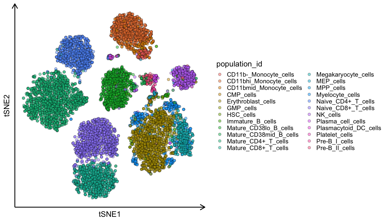
Now we plot the two dimensional tSNE plot which we calculated in the above code-chunk. If we colour the cells by their cell-type we can see that they are nicely clustered into distinct groups.
ggplot(ds, aes(tSNE1, tSNE2, fill = population_id)) +
  geom_point(pch = 21, size = 3, alpha = 0.5) +
  theme_classic(20) +
  theme(legend.position = 'right',
        axis.line = element_line(arrow = grid::arrow(length = unit(0.5, "cm"), ends = 'last'), size = 1),
        axis.text = element_blank(), axis.ticks = element_blank())
To run the Shapley function, I have modified this python script. It takes in our data frame, the celltype assignments, a sample size number for downsampling, the name of the clustering column and the names of our markers. I’m sure this could be written much more elegantly, but with my limited python experience this will have to do! We can copy this script into a dedicated python script on our computer, and later call it up in our R script.
import shap
import random

import pandas as pd
import numpy as np

import dr_explainer as dre

def custom_clustershapley(X, y, sample_size, cluster_col, feature_names):

    X = pd.DataFrame(X)
    y = np.array(y)

    X_vars = np.array(np.array(X.drop(cluster_col, axis = 1)))
    X_ds = X.groupby(cluster_col).sample(frac=sample_size, replace=True, random_state=1)
    X_ds_vars = np.array(np.array(X_ds.drop(cluster_col, axis = 1)))

    clusterShapley = dre.ClusterShapley()
    clusterShapley.fit(X_vars, X[cluster_col])

    shap_values = clusterShapley.transform(X_ds_vars)

    shap_df = pd.DataFrame(np.concatenate(shap_values), columns = feature_names)
    shap_df['cluster'] = pd.Series.unique(X[cluster_col]).repeat(len(X_ds)).tolist()

    return_dict = dict()
    return_dict['expression_vals'] = X_ds.drop(cluster_col, axis = 1)
    return_dict['shap_vals'] = shap_df

    return return_dict
Below we execute the function. Due to some ordering issues in the python script, the first three lines are a workaround to ensure the cell-types are not in the wrong order. We can then call up our python script and execute the function. Finally we just need to convert the data to an R data frame.
# Workaround
ids <- unique(ds$population_id)
names(ids) <- 1:length(unique(ds$population_id))
ds$population_id <- as.numeric(names(ids)[match(ds$population_id, ids)])

# Call python script
source_python("./custom_clustershapley.py")

# Execute shapley function
shap <- custom_clustershapley(X = select(ds, vars, population_id),
                              y = ds$population_id,
                              sample_size = 0.1,
                              cluster_col = 'population_id',
                              feature_names = vars)

# Convert python data to R data frames
shap_df <- py_to_r(shap$shap_vals)
exp <- py_to_r(shap$expression_vals) %>%
  gather(key = 'marker', value = 'expression') %>%
  select(expression) %>%
  unlist()

# Workaround
names(ids) <- unique(shap_df$cluster)
shap_df$cluster <- ids[match(shap_df$cluster, names(ids))]
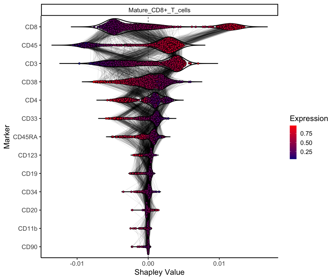
And finally we can plot our data! This plot shows the shapley value for each marker for a given cell-type (in this case mature CD8 T cells). The cells are coloured by their normalised expression of each marker, and markers are ordered by their mean absolute Shapley value for that celltype. Lines connecting the points indicate that these two points are the same cell. So we can see that the CD8 marker is particularly important to define mature CD8 T cells, which is unsurprising. However we can also see that cells with a high expression of CD4, CD33, CD38, and CD45RA, tend to have a negative Shapley value, where mature CD8 T cells express lower levels of these markers.
celltype <- 'Mature_CD8+_T_cells'

shap_df %>%
  mutate(id = 1:nrow(.)) %>%
  gather(key = 'marker', value = 'shapley_value', -id, -cluster) %>%
  filter(cluster == celltype) %>%
  mutate(Expression = exp) %>%
  ggplot(aes(reorder(marker, shapley_value, function(x) mean(abs(x))), -shapley_value, fill = Expression)) +
  geom_hline(yintercept = 0, colour = 'black', lty = 2) +
  geom_violin(alpha = 1, trim = F, scale = "width", fill = NA, size = 1, colour = 'black') +
  geom_line(aes(group = id), alpha = 0.1, position = ggbeeswarm::position_quasirandom()) +
  ggbeeswarm::geom_quasirandom(pch = 21, size = 2) +
  facet_wrap(~cluster, scales = 'free_y') +
  coord_flip() +
  theme_classic(20) +
  scale_fill_gradient(low = "darkblue", high = "red", na.value = NA) +
  labs(x = 'Marker', y = 'Shapley Value')
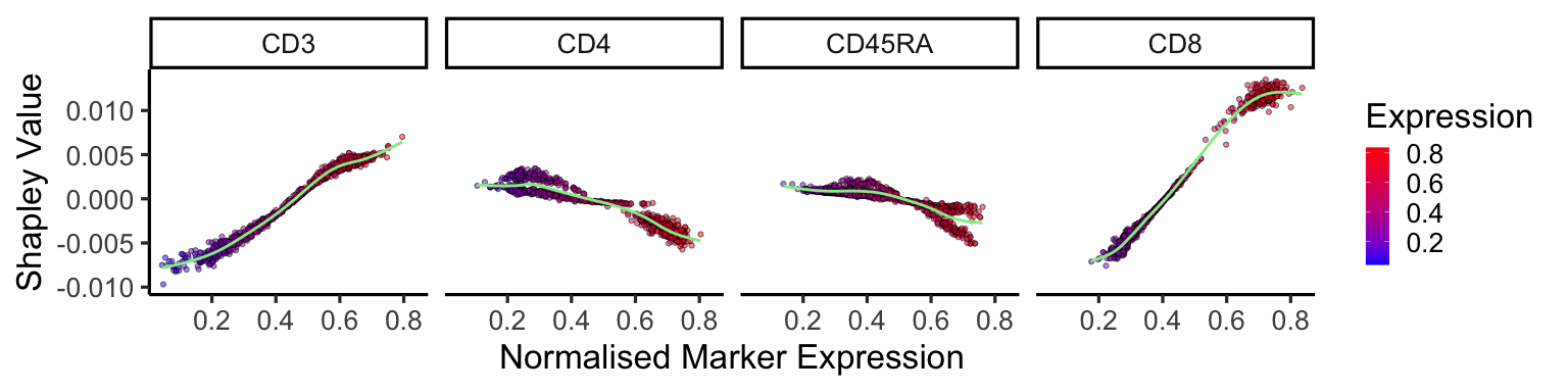
We can also plot the change in Shapley values as the expression of the markers increases. Positive correlations, such as CD3 and CD8, show that for mature CD8 T cells an increased expression in these markers increases their Shapley value, therefore contribute more to the cell being a mature CD8 T cell. The opposite is true for negative correlations.
shap_df %>%
  gather(key = 'marker', value = 'shapley_value', -cluster) %>%
  filter(cluster == celltype) %>%
  mutate(Expression = exp) %>%
  filter(marker %in% c('CD3', 'CD4', 'CD8', 'CD27', 'CD45RA')) %>%
  ggplot(aes(Expression, -shapley_value, fill = Expression)) +
  geom_point(alpha = 0.5, pch = 21) +
  facet_wrap(~marker,nrow = 1) +
  geom_smooth(colour = 'lightgreen', se = F) +
  scale_fill_gradient(low = "blue", high = "red", na.value = NA) +
  theme_classic(25) +
  labs(x = 'Normalised Marker Expression', y = 'Shapley Value')
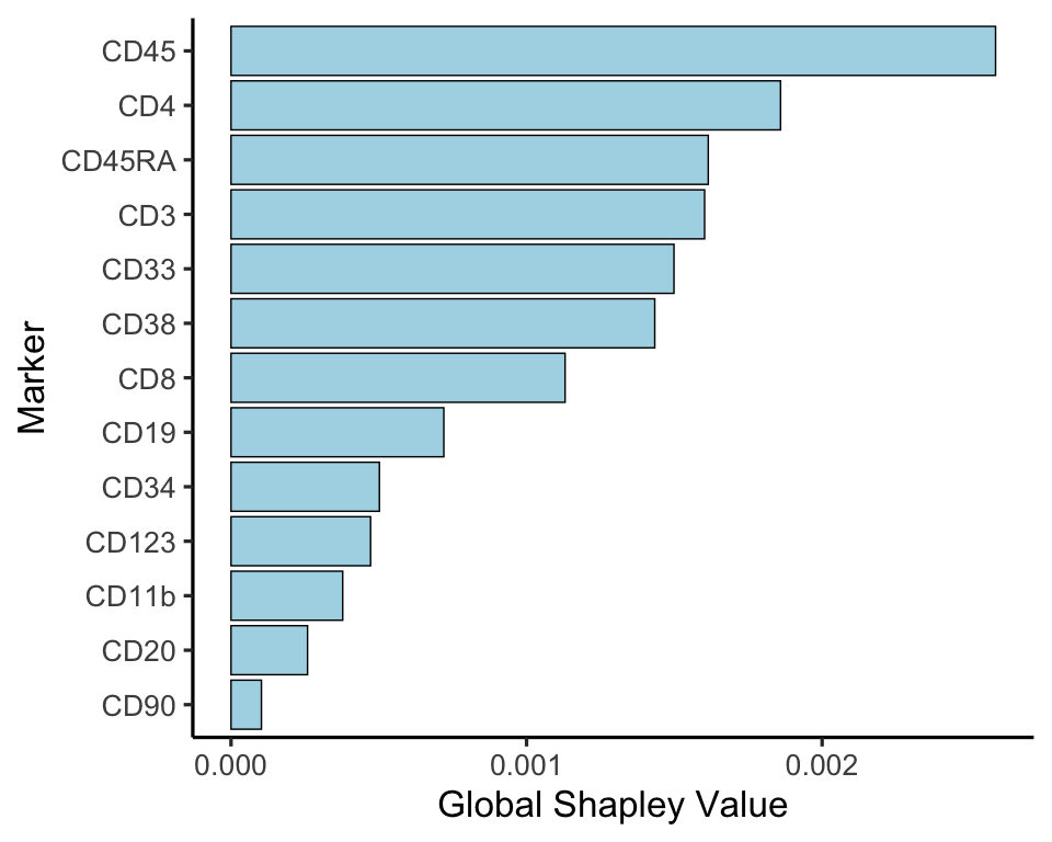
Finally, we can also plot the overall Shapley value by taking the marker-wise mean of the absolute Shapley value. This then shows us the global importance of each marker to define all celltypes.
shap_df %>%
  gather(key = 'marker', value = 'shapley_value', -cluster) %>%
  group_by(marker) %>%
  summarise(shap = mean(abs(shapley_value))) %>%
  ggplot(aes(reorder(marker, shap), shap)) +
  geom_bar(stat = 'identity', fill = 'lightblue', colour = 'black') +
  theme_classic(25) +
  coord_flip() +
  labs(x = 'Marker', y = 'Global Shapley Value')
Limitations
Using Shapley values to explain dimensionality reduction comes with a few limitations. Firstly, it is highly computationally intensive. Running the above example on a subset of 1000 cells took over an hour on my laptop, and this only increases with the addition of further markers or cells. Secondly, the Shapley value method can produce misleading results when features are highly correlated. This is a particularly important point in the above example, as cell markers will often be correlated (e.g. CD4 T cells express both CD4 and CD3). This could lead to results where the feature importance is attributed to only one of the correlated markers, giving you the misleading result that the other marker does not carry much importance. However, having looked at various celltype Shapley values in the above example, I believe that the results are consistent with what one would expect.
Conclusion
Shapley values are a useful tool to explain dimensionality reduction. Using it as above on CyTOF data allows for the calculation of cell-type wise marker importance, as well as global marker importance.